UX/UI DESIGN | YooCall

From walking to riding: Redefining movement inside large venues

Context

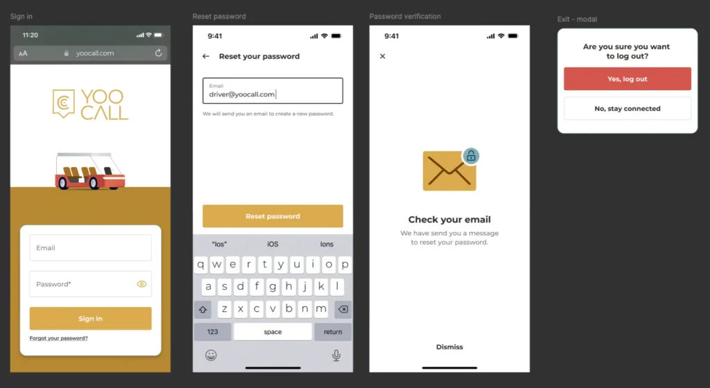
YooCall is a mobile application developed by ParkPoint to improve on-site mobility in large venues such as shopping malls, business parks, and recreational complexes.
In these spaces, visitors often need to cover long walking distances under the Gulf’s high temperatures — from the parking area to the entrance, or between different parts of the property.

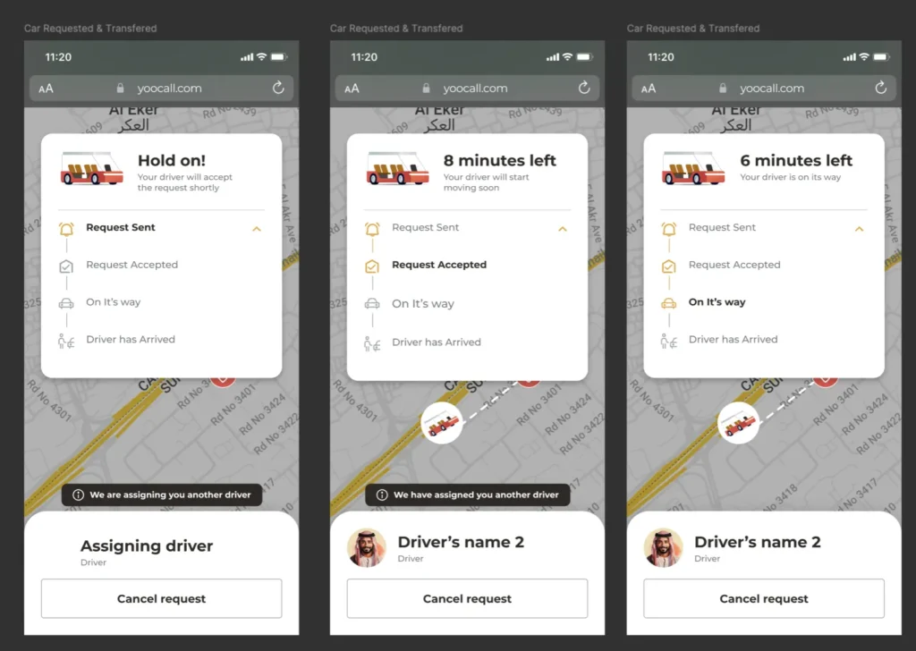
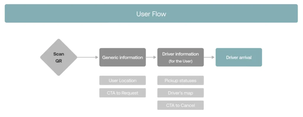
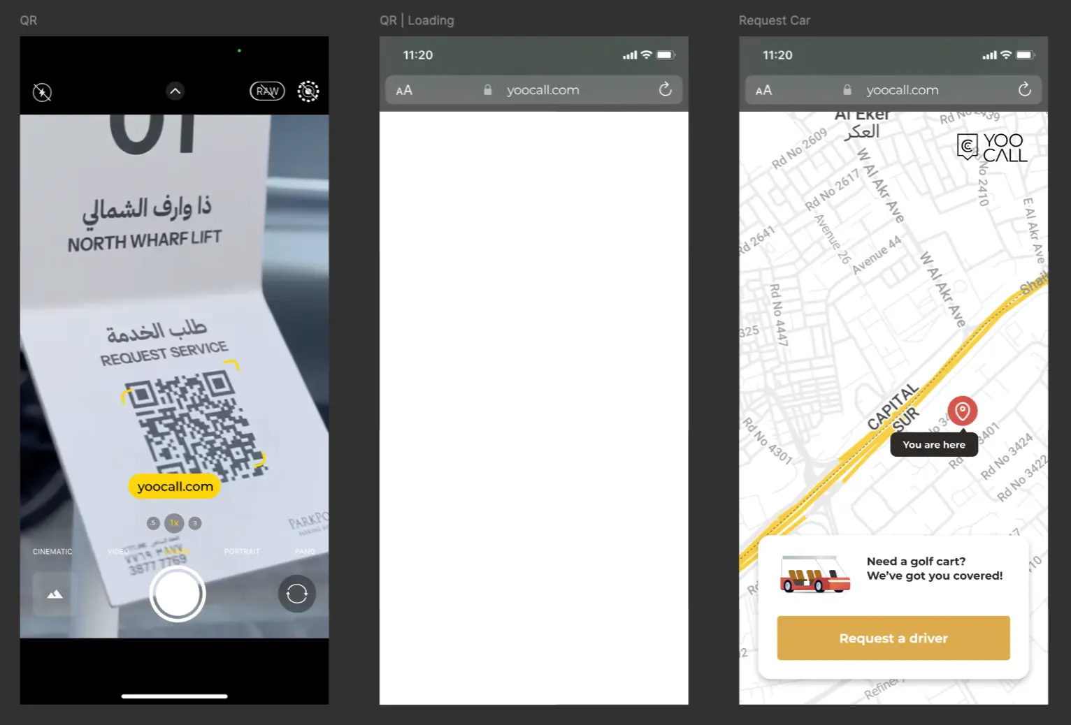
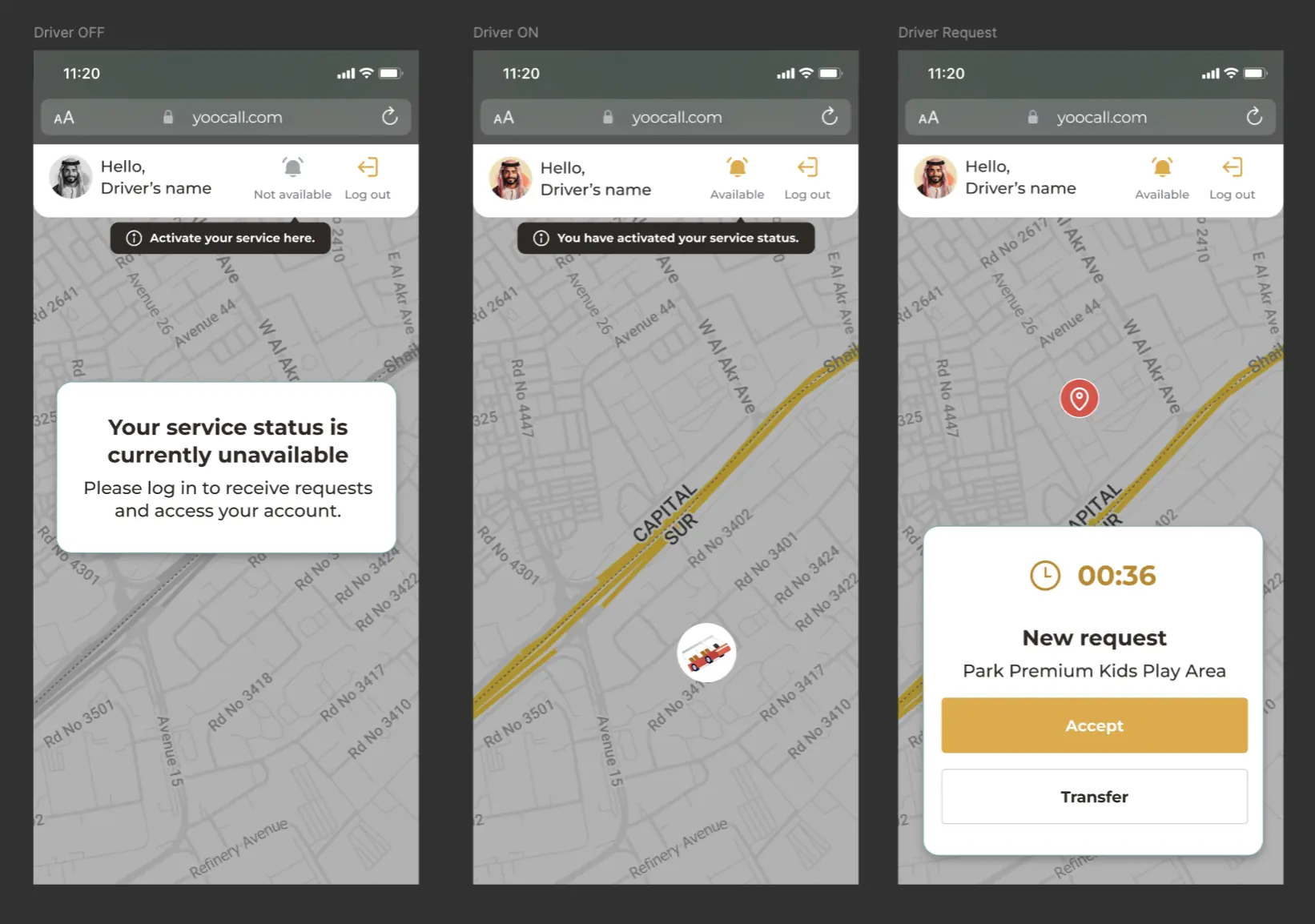
YooCall was created to make this movement effortless. By using the app, users can call a golf cart driver directly from their smartphone, making their visit faster, more comfortable, and accessible to everyone, including families, seniors, and people with limited mobility.

Solution

The design challenge was to create a dual-flow system that works intuitively for both passengers and drivers, while maintaining consistency and simplicity in the user experience.

Flow 1 — Passenger Experience

Visitors can scan a QR code placed at designated stops or inside the venue to instantly open YooCall without needing to download the app. From there, they can:

  • See their current location and nearby available golf carts

  • Request a ride to a specific drop-off point

  • Track the cart’s arrival in real time on the map

This flow was designed to minimize effort — from scanning to requesting a ride in under 15 seconds. Large buttons, location-based interactions, and clear visual cues make it accessible for users of all ages.

Flow 2 — Driver Experience

The second user flow focuses on drivers, who use a dedicated interface to receive and manage ride requests. Drivers can:

  • View incoming ride requests with passenger location and destination

  • Accept or decline requests

  • Navigate efficiently to pickup points via integrated GPS

  • Update ride status (e.g., on the way, arrived, completed)

This flow was optimized for use while operating the vehicle — simple, high-contrast screens, large touch targets, and real-time updates reduce cognitive load and support safety.

Together, these two interconnected experiences ensure that both users and drivers can interact effortlessly, keeping the system running smoothly.

Development

The process began with user research to understand visitor and driver behaviors.

Using those insights, I mapped out both user journeys to identify friction points — such as unclear pickup zones or slow communication between users and drivers.

I then created wireframes and interactive prototypes for both sides of the experience, validating each step with usability testing sessions involving real users and drivers.
The UI design followed ParkPoint’s visual identity but introduced new dynamic elements (such as real-time maps and motion feedback) to highlight the app’s active, service-oriented nature.

The final product was supported by a shared design system, ensuring consistency across passenger and driver interfaces while allowing for functional differentiation.

Results

The launch of YooCall had a measurable positive impact on user experience and operations:

  • Faster response times, as QR-based requests directly reached available drivers.

  • Higher user satisfaction, particularly among visitors with mobility limitations.

  • Improved efficiency for drivers, who could manage requests and navigation within a single interface.

  • Enhanced brand perception of ParkPoint as a pioneer in smart venue mobility solutions.

Conclusion

YooCall successfully connected people and mobility in large environments through a simple, dual-experience app.

By designing for both sides of the service — passengers and drivers — the project demonstrates how user-centered thinking and clear interface design can make movement within large venues effortless and enjoyable.

YooCall reinforces ParkPoint’s vision of bringing smart, human-centered mobility to everyday spaces.

Let’s work together!

I’d love to hear from you—let’s turn your vision into something amazing.