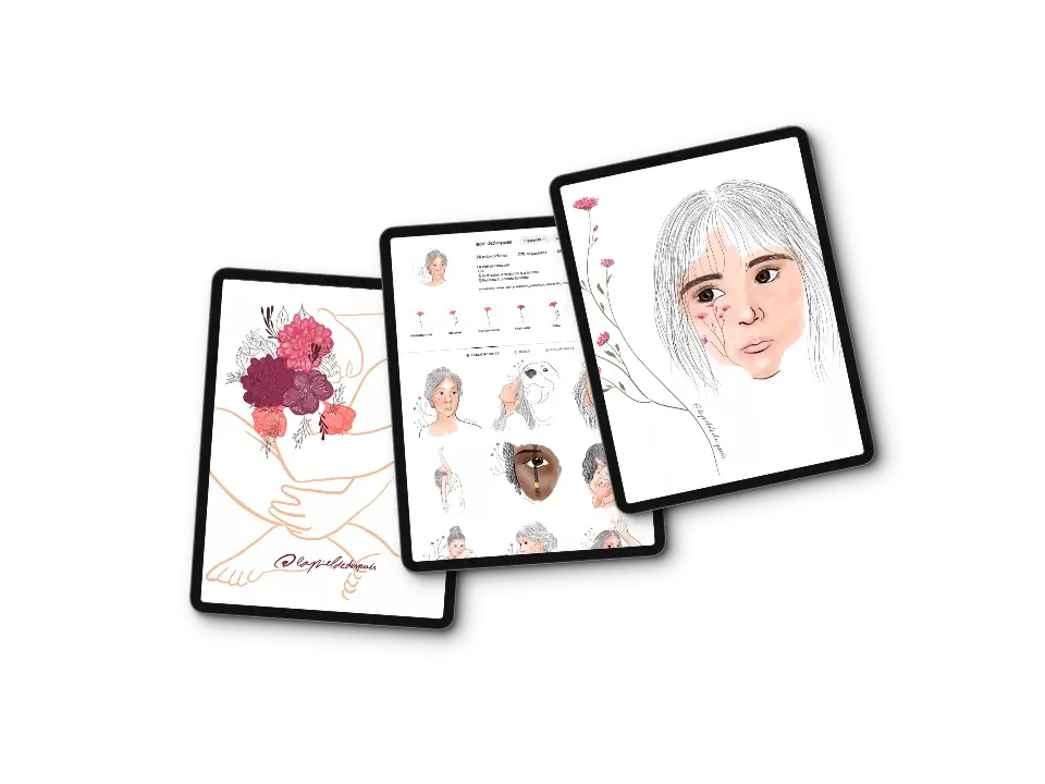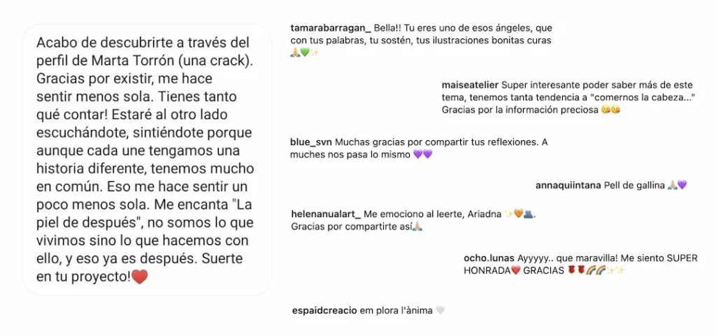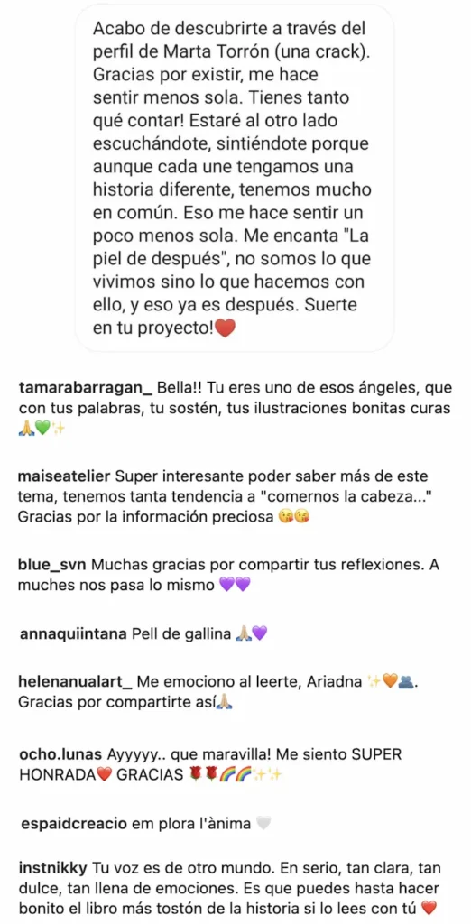
La Piel de Después was born from a personal need to explore and communicate social and mental health issues. Initially, it served as a way to voice concerns and create a space for reflecting on the impact of these challenges in daily life. However, over time, this initiative evolved into the core of my master’s final project. The goal was to design and develop a web platform that was not only functional and visually appealing but also adhered to high standards of accessibility, speed, and optimization.
From the outset, one of the central objectives of La Piel de Después was to craft a user experience that went beyond functionality. The platform needed to be intuitive, welcoming, and deeply connected to the social and emotional themes of the project. It was crucial for the design and navigation to invite users to explore, reflect, and engage, fostering a sense of closeness and empathy from the very beginning.
This meant developing an interface that was more than efficient. The aim was to create a digital environment that resonated emotionally, allowing users to feel part of a community addressing complex issues with sensitivity and humanity.
One of the main challenges was managing a large volume of diverse content: audiovisual interviews, illustrations, specialized articles, and practical resources for addressing social issues. The technical complexity of integrating all these elements without compromising the user experience was significant. Additionally, creating the content required finding collaborators who shared the project’s vision, necessitating the building of relationships based on trust and common goals.

To address these challenges, I implemented a strategic approach based on analysis and optimization tools. I utilized specialized platforms like SEMRush, Google Search Console, and Google PageSpeed Insights to identify areas for improvement in the website’s structure and performance. These tools allowed me to analyze specific data on site performance, such as loading times and search engine positioning, to make informed decisions.
Some key improvements included:
- Using WebP image formats, which reduced file sizes by up to 30% without compromising visual quality.
- Implementing a minimalist and clean design to avoid unnecessary distractions, keeping the focus on the primary content.
- Establishing clear hierarchical structures to simplify navigation and prioritize access to the most important sections of the site.

The project’s development began with wireframes that defined the website’s visual and functional structure. This step was essential to ensure that every element was designed with the user experience in mind. The site was built using WordPress, leveraging the Elementor Pro plugin to customize the design and ensure adaptability across various devices.
A Welcoming and User-Friendly Design
To convey warmth and approachability, the visual and functional design focused on:
- Vibrant yet organic colors: The color palette included violet tones symbolizing strength, and warm oranges evoking tranquility and optimism, aligning with the project’s values.
- Readable and emotional typography: The combination of characterful yet easy-to-read fonts balanced artistic flair with practicality, blending stylized headers and minimalist body text.
- Dynamic micro-interactions: Small animations and transitions, such as responsive buttons or soft effects when loading images, added an interactive, modern touch that enhanced user immersion.
An Artistic and Immersive Approach
La Piel de Después was envisioned not just as an informational space but as an aesthetic experience that reflected the creativity of its content. This was achieved through:
- Artistic multimedia integration: Original illustrations were highlighted as central elements in each section, providing a powerful visual context that complemented the articles and resources.
- Symbolic use of voice: Audiovisual pieces were paired with voiceovers, either by myself or collaborators, to convey intimacy and realism. The goal was to “give voice” to social issues by utilizing every available artistic resource.
An Intuitive Experience
The interface design was crafted so that any user, regardless of their digital skill level, could navigate the platform with ease. This was achieved through:
- Simplified navigation: A clearly structured menu accessible from any page reduced friction, ensuring key options were always visible.
- Personalized experience: The platform offered recommendations based on user behavior, suggesting content related to the topics they explored most.
- Natural navigation flows: Internal links and calls-to-action (CTAs) were designed to guide users toward relevant resources without feeling artificially directed.
During the process, I conducted five user tests with a target group of individuals aged 20–30. These tests revealed behavioral patterns that directly influenced design decisions, such as:
- Enhancing article readability by strategically using bold text to highlight key points.
- Including full transcripts for audiovisual interviews, making the content accessible to users with hearing disabilities or those who preferred reading over listening.
- Optimizing the navigation menu to reduce the time users spent finding their desired content.
Additionally, I conducted heuristic analyses to evaluate the website’s usability based on principles such as consistency, visibility of important functions, and system feedback. This analysis enabled me to fine-tune specific design elements to enhance the overall experience.


