Holaluz: Microsite

Resume

A significant improvement was achieved in the design of a microsite in the energy sector through a user-centered and research-driven approach. This project optimized navigation, effectively communicated the value proposition, and aligned the design with the brand’s key attributes, resulting in a +2.5% increase in the main KPI.

interviews
+ 0
improvement
+ 0 %
brand cohesion
0 %

The energy sector presents unique challenges in how users perceive products and services. Through research conducted between 2023 and 2024, critical areas for improvement were identified in the digital experience to build trust and enhance understanding of the value proposition.

2023 Rebranding:

  • A strategic rebranding effort at Holaluz emphasized key attributes such as savings, quality, personalization, and simplicity.
  • Research focused on identifying these attributes in users’ perceptions through interviews and concept testing.

2024 Research:

  • Insights were gathered from users who chose competitors over our product. Key barriers included distrust and perceived high pricing.
  • Interviews conducted in October-November included online surveys with incentives, gathering 132 complete responses.

These studies revealed that a confusing digital experience with excessive information on a single page negatively impacted the product’s perception.

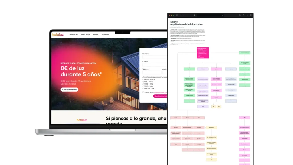
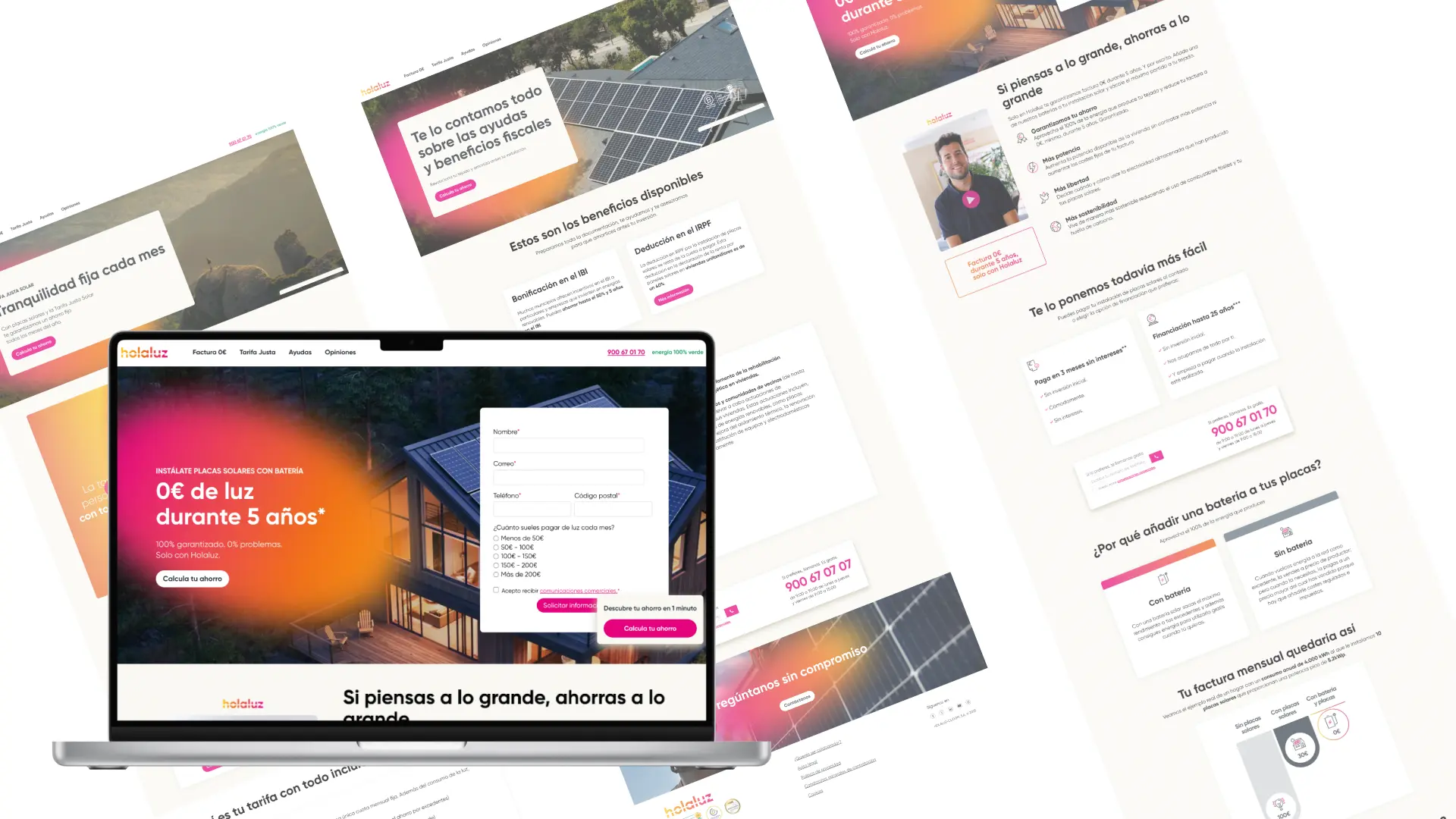
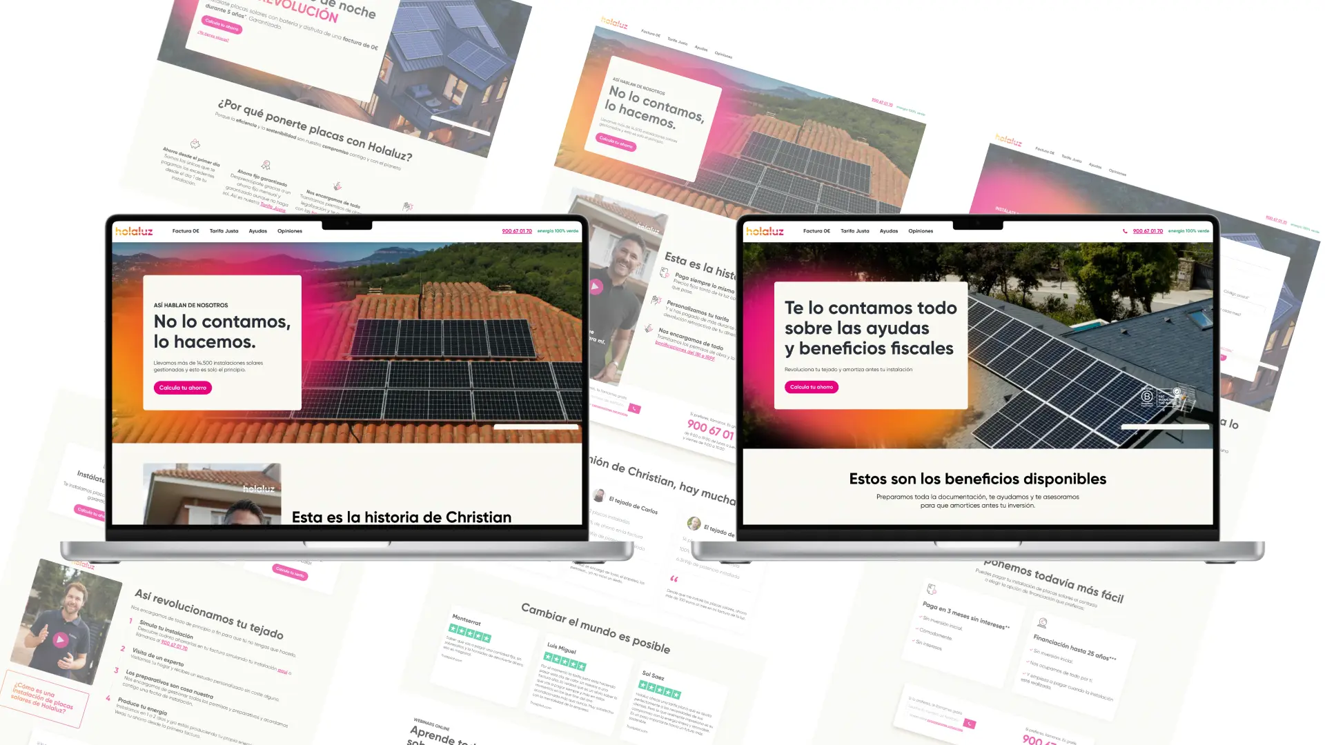
The microsite design focused on delivering a clear, intuitive experience aligned with user expectations. The main UX/UI design strategies included:

  1. Information Architecture:

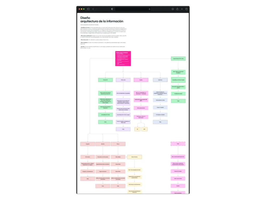
    • Navigation was structured across six distinct pages, enabling users to process information logically and sequentially.
    • Hierarchical design principles and visual prioritization guided users to key content.

  2. Visual Storytelling:

    • Explainer videos were incorporated to effectively convey the value proposition. This format simplified complex concepts and enhanced user trust.

  3. Data-Driven Optimization:

    • Research insights from qualitative and quantitative data informed every design decision.
    • A/B testing validated hypotheses, comparing different page structures and visual elements.

  4. User-Centered Approach:

    • Pain points in the digital flow, such as lack of clarity and trust, were identified.
    • Solutions included transparency-focused elements, such as direct contact buttons and visual testimonials to reinforce reliability.

  5. Interdisciplinary Collaboration:

    • Worked closely with the research team to analyze insights and the development team to ensure the technical feasibility of proposed solutions.

Research:
The initial phase involved interviews and qualitative analysis to understand the factors influencing user decisions.

Key Findings:

  • 48% of respondents did not engage with a sales representative, citing distrust as the main reason.
  • Perceived high pricing was another significant factor.


Design Iteration:

Based on these insights, iterative design processes were initiated:

  • Creation of low-fidelity prototypes to test navigation flows.
  • Evaluation of these prototypes through user testing to identify friction points.
  • High-fidelity design focused on a visually appealing aesthetic aligned with brand attributes and universal accessibility.


Technical Implementation:

In collaboration with the development team, technical feasibility was ensured, including fast load times, responsive navigation, and consistent cross-device experiences.

Analysis of the previous design

To improve the design following the research phase, I also analyzed over 100 user recordings from the old microsite, along with heatmaps, to identify the areas of greatest user interest. I reviewed the information module by module to assess whether it aligned with the attributes of the new value proposition.

After completing the analysis, I proposed a new navigation structure where the value proposition was explained in greater detail. This allowed users to explore different specifications more thoroughly instead of being overwhelmed by all the information at once.

After completing the analysis, I proposed a new navigation structure where the value proposition was explained in greater detail. This allowed users to explore different specifications more thoroughly instead of being overwhelmed by all the information at once.

Impact on Key Metrics:

  • +2.5% increase in the main KPI (simulator starts).
  • Improved retention within the microsite due to more intuitive and clearer navigation.


Enhanced Brand Perception:

  • Strengthened attributes of simplicity and personalization.
  • Use of visual formats, such as videos, improved user comprehension and trust.


Streamlined User Journey:

  • Reduced friction points identified during research.
  • Full alignment of the microsite with digital workflows, contributing to a cohesive digital experience ecosystem.

This project demonstrated the tangible impact of applying user-centered design principles supported by research and iterative testing. The combination of optimized information architecture, visual storytelling, and a brand-aligned aesthetic not only improved user experience but also drove business results.

Future steps involve ongoing research to measure the long-term effects of these improvements on trust perception, continuing with an iterative and data-driven approach.