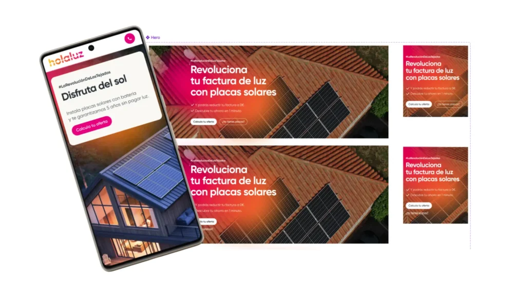
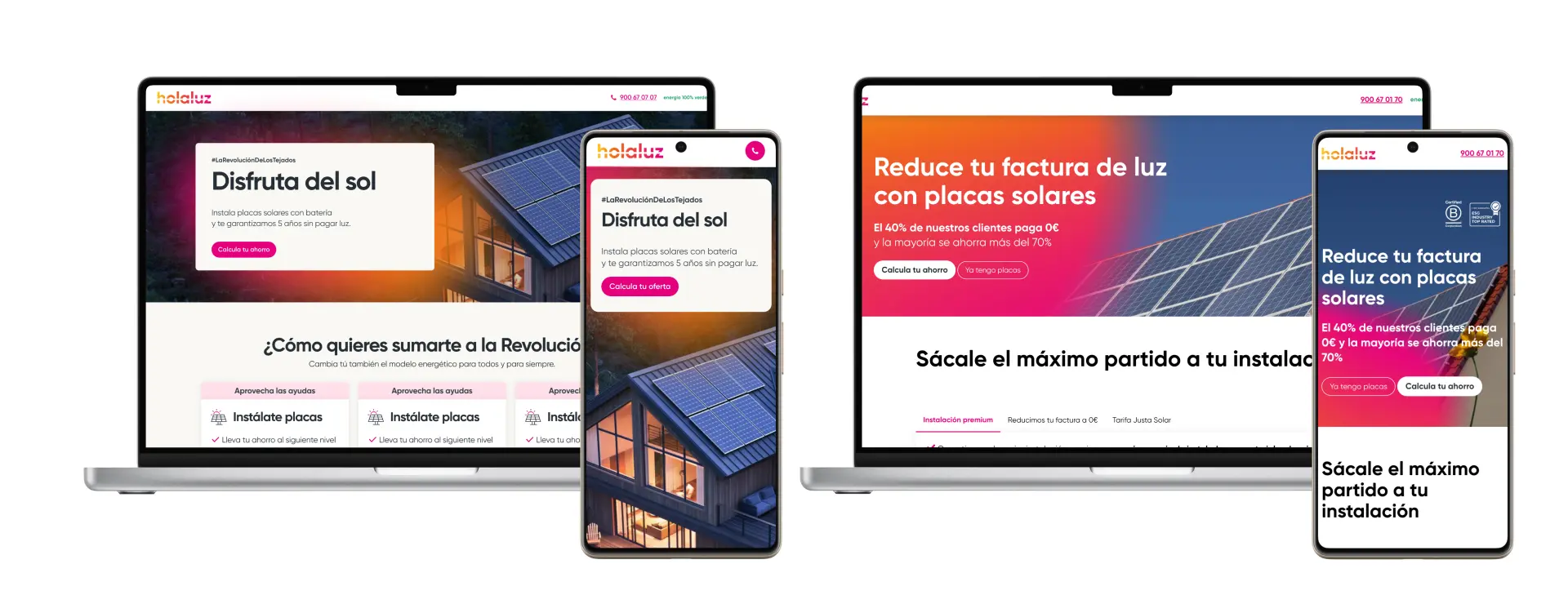
The header is one of the most critical elements of a website, acting as a key driver for user engagement and conversions. Despite its importance, our original header (referred to as Header A) had been in place for years without significant updates. While it featured white text over a colorful gradient background, it became clear through casual observation that the design might be hindering readability, particularly on smaller screens or in lower lighting conditions.
Unlike typical projects involving in-depth research, this initiative was sparked by a simple observation: the contrast between the white text and the gradient background in Header A was insufficient, potentially causing users to overlook important CTAs. With this hypothesis in mind, I decided to experiment with alternative designs to improve clarity and effectiveness.


