UX/UI DESIGN

HOLALUZ

Designing a new header that achieved a +52.47% improvement in conversion compared to the original header.

Context

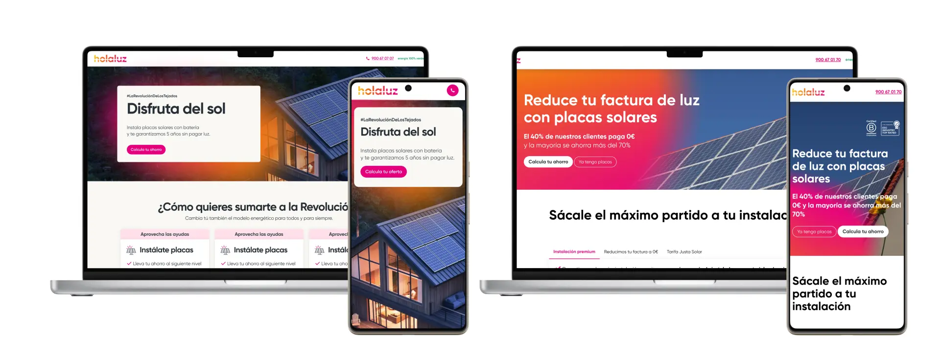
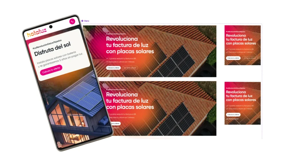
The header is one of the most critical elements of a website, acting as a key driver for user engagement and conversions. Despite its importance, our original header (referred to as Header A) had been in place for years without significant updates. While it featured white text over a colorful gradient background, it became clear through casual observation that the design might be hindering readability, particularly on smaller screens or in lower lighting conditions.

Unlike typical projects involving in-depth research, this initiative was sparked by a simple observation: the contrast between the white text and the gradient background in Header A was insufficient, potentially causing users to overlook important CTAs. With this hypothesis in mind, I decided to experiment with alternative designs to improve clarity and effectiveness.

Solution

To validate the hypothesis and identify a better-performing design, two alternative headers were created and tested alongside the original. The goal was to improve contrast, readability, and overall user engagement without losing the visual appeal of the header.

The designs were as follows:

1️⃣ Header A (Original): Featured white text over a colorful gradient background.

2️⃣ Header B: Used dark text placed within a white rectangular box, creating a sharp contrast with a more structured and clean look. The CTA button was also more prominent with a vibrant accent color.

 3️⃣ Header C: Emphasized simplicity, with dark text on a fully white background. This version reduced the prominence of images and used rounded shapes to create a softer, modern aesthetic.

Development

The project unfolded in three main phases:

1️⃣ Hypothesis Formation
Unlike a typical design project that starts with comprehensive user research, this initiative was based on casual observations about readability and contrast issues in the original header.

2️⃣ Design and Prototyping
I quickly iterated on two alternative headers (B and C), emphasizing clarity and user focus:

Header B: Balanced strong contrast and structure with a clean design that framed key messages in a white box.

Header C: Focused on minimalism and modernity, prioritizing whitespace and rounded elements.

3️⃣ A/B Testing
The headers were subjected to a four-week A/B/C testing process on the live website, with traffic evenly distributed among the three versions. The primary metric was conversion rate, defined as clicks on the main CTA button. Secondary metrics included time on page and engagement rate.

Results

The results of the test provided clear insights into user preferences and behavior:

Header A (Original): Served as the baseline, showing average performance with lower contrast and less clarity.

Header B: Outperformed both alternatives, achieving an impressive +52.47% improvement in conversions compared to Header A. The minimalistic approach and enhanced readability resonated strongly with users, particularly on mobile devices.

Header C: Delivered a +23% increase in conversions compared to Header A, confirming that increased contrast and structured framing positively impacted user engagement.

Conclusion

This project highlights how even simple design adjustments, when informed by thoughtful observation and testing, can have a dramatic impact on performance. By addressing the contrast issue identified in the original header, we achieved significant improvements in user engagement and conversions.

Key takeaways from this case study include:

👩🏻‍💻 Small Changes Matter: Incremental design updates, such as enhancing contrast and simplifying layouts, can yield substantial results.

🚀 Test and Learn: Even without extensive upfront research, A/B testing provided actionable data to validate our hypothesis.

📈 Prioritize Readability: Designs that focus on clarity and accessibility perform better across all audience segments.

This initiative serves as a reminder that optimizing critical website elements, even based on simple observations, can drive meaningful results and enhance the user experience.

Hi, I’m Ariadna! 👋

My approach as a Product Designer is simple: understand people, solve their problems, and create products that inspire them. From clean interfaces to intuitive experiences, I design with empathy and purpose.

Let’s work together!

I’d love to hear from you—let’s turn your vision into something amazing.